My 2021

Hi! It’s been a while. I wanted to write an article to explain what I’ve been up to lately, and share some hopefully interesting thoughts.

Yearly write up

Hopefully, I’ll be able to write more than one article next year. It’s been busy for sure, and just really a big change of scene. When covid first arrived, I had just started working at Idean. Now – almost two years later(!), a lot of things have changed.

Starting my own company

So I started a company, Ryfylke React AS. It came about mostly as a means to an end when I got a possible offer to work on a new project over at Telenor. The offer went through and I’ve now been working at said project on behalf of my own company for almost a year (since February 2021).

Starting the company has been an interesting process. There are obviously lots of logistics to take care of, taxes, stuff like that – but it’s mostly gone smooth. The independence and economic stability that I’ve gained has far outweighed the cost of the time I’ve spent doing work unrelated to web development.

The project

One of the reasons I’ve been so silent over here for the past year has been the strict NDA policy. I won’t be able to share any of the specifics, but I can delve into some interesting challenges that I’ve met – and so I figured I’d use this article to do exactly that.


🤫

Scaling up

This project is definitely the most complex and large-scale project I’ve worked on so far. It involves a lot of graph work, data visualisation and interesting components. One thing I’ve really enjoyed, is having more of a say in how the code is set up and organised. We have a great setup for working with styling, forms, the API and testing – all very important things on large-scale projects. On that note…

Javascript testing

This was honestly a subject I wasn’t very experienced at last year – but something I now feel a lot more comfortable with. I wouldn’t say that we necessarily use test-driven development, yet, in our case it was more of a necessity that we’ve been working at after the fact.

We started out with functional tests, using Testcafè. I’ve enjoyed the developer experience working with this library, and it’s worked well for our setup. Most of our pages have a dedicated file with functional tests related to it. Lately, we’ve also started writing unit tests for our components, using Jest and React Testing Library. The flow and syntax is very similar to Testcafè, which has made that transition pretty smooth and painless so far.

Further developing my “stack”

As a developer (and human), your opinions are constantly flavoured by your experience. These are some of the technologies that I’ve found really great, and that I don’t see myself swapping out voluntarily in the near future.

🔥 react-hook-form

I can’t say enough good about this library. It’s a blast to work with, it’s easy to implement into any component library and it does a really good job of keeping your codebase clean, yet still giving you powerful utils. Coupled with yup for validation, react-hook-form has truly made coding forms a much better experience for me.

🔥 Redux toolkit

Has made working with redux (and especially async and API logic in conjunction with redux) a breeze. Love it.

🔥 styled-components

I have mostly thrown away classnames for styling in favour of writing styled components. Makes the markup real pretty and lets me essentially write SCSS, but with some powerful Javascript coupling through props.

And more…

I’ll make a separate post about my full stack that can evolve separately from this article, I just wanted to share some thoughts I’ve picked up over the last year.

Open source work

I’ve finally popped my cherry on open source work as well, mostly on Carbon Design System. I’ve opened a few issues that I encountered when using their components – participated in discussions, and even made a pull request related to one of my issues.

The team over at IBM has been very helpful and welcoming – and I’ve enjoyed the experience. I’ve always been a big fan of open source as a concept and I’m glad I’ve finally had the chance to start making a meaningful contribution. This is something I hope to do more of in 2022.

What else…

Well, I moved back home to Suldal, in with my girlfriend. That’s a pretty big one. Lovely place, I’ve gotta say. We have two cats. Molly I’ve had for several years now, but Luci is just barely a year old – and he’s technically my girlfriend’s cat. They get along alright, better now than in the beginning – had to have them both neutered.

I guess to summarise, I’ve had a really busy but really amazing year. I’ve learned lots of interesting stuff and developed as a developer – and I’ve also made big changes in my personal life. All in all, I’m happy with how things have gone and I’m looking forward to next year.

Hopefully not until then,
Håkon.

Watching the size of a React element

I’ve recently come upon the task to replace a React accordion component from a UI library. This turned out to be an interesting challenge that has taught me a few things about MutationObservers and layout effects.

The problem

If you’re going to animate between states, you’re going to need hard values. There is a trick to work around this: animating the max-height to something taller than ever needed – but then you’d somewhat lose control over the animation-duration and easing.

The solution

So we’re going to need the height of the content. Fair enough, just slap in a useEffect and ref and check the height of the element, right? ❌

What if the user resizes the browser-window and the content shifts around and suddenly it’s three lines instead of two? Ok fair enough, let’s slap on a useLayoutEffect with a window resize listener. Now we’ve got to be safe, right? ❌

If the content of the accordion is dynamic, and shifts height after user interaction – then we need a way to handle that as well. This is where our MutationObserver comes in. Setting up one is quite easy:

const [mutationObserver, setMutationObserver] = useState(null);
const checkForHeight = () => {/* ... */};
const setupMutationObserver = () => {
    if (!mutationObserver && ref.current) {
      const observer = new MutationObserver(checkForHeight);
      observer.observe(ref.current, {
        attributes: true,
        attributeOldValue: true,
        childList: true,
        characterData: true,
        characterDataOldValue: true,
        subtree: true
      });
      setMutationObserver(observer);
    }
};
useEffect(() => {
  setupMutationObserver();
  return () => {
    if (mutationObserver){
       mutationObserver.disconnect();
    }
  }
}, []);

You probably won’t need all of those options, you can read more about them here.

Abstracting this into a hook

You might not want to have all of the above boilerplate, coupled with resize listeners and more for every component that you need to watch the height/width of. Because of this, I’ve abstracted everything into an easy to use hook.

Note: If you are running a live-server or any type of live-reload while developing and this method stops working – it’s most likely because the while reloading your code it might run the cleanup function and disconnect the MutationObserver. I’ve yet to resolve this bug, but it does not occur in production.

Tips for CSS animations

Here are a few tips and tricks I’ve picked up over the years that will help you create interesting and performant animations & transitions for your next project.

Tip #1 – Some properties are more taxing than others

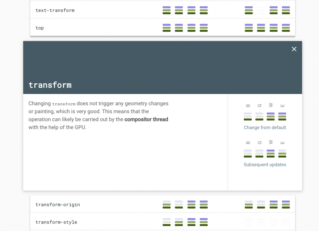
The most common cause of laggy animations on the web comes down to this. Generally, most properties go through all three stages of rendering; layout, paint and composite. This takes away precious processing power and can lead to things like laggy scrolling. You can check out which properties are the most taxing and why at https://csstriggers.com/.

A decent workaround

Generally, you want to limit animations and transitions to only ever use transform and opacity when possible. This strips away the need for the browser to go through the layout and paint phases, making the animations appear smoother for the less powerful devices.

Instead of animating the taxing properties directly, place them on a psuedo element and animate that psuedo element using opacity or transform

Below is an example where box-shadow is animated using opacity on a psuedo-element, instead of animating the box-shadow property directly:

/* Animating box-shadow without transitioning box-shadow property */
.box{
  width:500px;
  height:500px;
  background:hotpink;

  position:relative;
}
.box::after{
  /* Position element below  */
  content:"";
  position:absolute;
  z-index:-1;
  top:0; left:0; right:0; bottom: 0;
  pointer-events:none;
  
  /* Apply box-shadow and hide initially */
  box-shadow:0px 0px 10px -5px #000;
  opacity:0;
  transition:opacity .2s;
}
.box:hover::after{
  /* Transition and show box-shadow on hover */
  opacity:1;
}

Tip #2 – Animating borders

Using the same technique as above, we can easily animate borders using scaleX and scaleY

/* Animating borders using psuedo-element */
.box{
  width:500px;
  height:500px;
  background:hotpink;

  position:relative;
}
.box::after{
  --borderWidth: 2px;
  /* Position element below  */
  content:"";
  position:absolute;
  z-index:-1;
  top:calc(var(--borderWidth) * -1); /* Minus border width */
  bottom:calc(var(--borderWidth) * -1); /* Minus border width */
  left:0; right:0;
  pointer-events:none;
  
  /* Apply borders */
  border-top: var(--borderWidth) solid #000;
  border-bottom: var(--borderWidth) solid #000;
  /* Initially shrink horizontally */
  transform: scaleX(0);
  transition: transform .2s;
}
.box:hover::after{
  /* Transition and expand border on hover */
  transform: scaleX(1);
}

Tip #3 – Use animation-fill-mode

Let’s say you want to fade something in, but you want there to be a delay before the fadein occurs.

If you try just adding animation-delay, the element would show until the delay is over and then abruptly disappear then fade in again, as seen here:

How do we prevent this from happening?

One method, which a lot of people immediately reach for, would be creating some unnecessarily complicated keyframes to keep it hidden until a certain percentage and playing around with animation-duration.

A far better method is to use animation-fill-mode.

By setting animation-fill-mode: backwards; we are essentially telling the browser:

” Hey, for the duration of the animation-delay, keep the CSS from the first relevant keyframe active. “

The first relevant keyframe in this context just means the first keyframe that is played in the animation, which depends on the animation-direction property.

You could also set animation-fill-mode to both, then it would also retain not only the CSS from the first keyframe, but also the CSS from the last keyframe after the animation has finished.

In our example, that would mean keeping the opacity during the pre-delay, as well as the pink background after the animation is complete:

Tip #4 – Stagger animations using CSS variables

It’s fair to assume that most of the time when dealing with lists of items on modern websites, they are rendered using some sort of Javascript loop.

By grabbing the index in the loop and applying it as a CSS variable to the element, we can then this index to calculate animation-delay to get a nice and clean stagger effect.

Here’s an example using plain old vanilla js:

const listItems = document.querySelectorAll("ul li");
listItems.forEach((item, index) => {
   item.style.setProperty("--i", index);
});

Now in our CSS, let’s apply the animation-delay:

@keyframes fadeIn {
  from{
    opacity: 0;
  }
}

li{
  animation: fadeIn .2s ease-in-out;
  animation-fill-mode: backwards;
  animation-delay: calc(var(--i) * 0.1s);
}

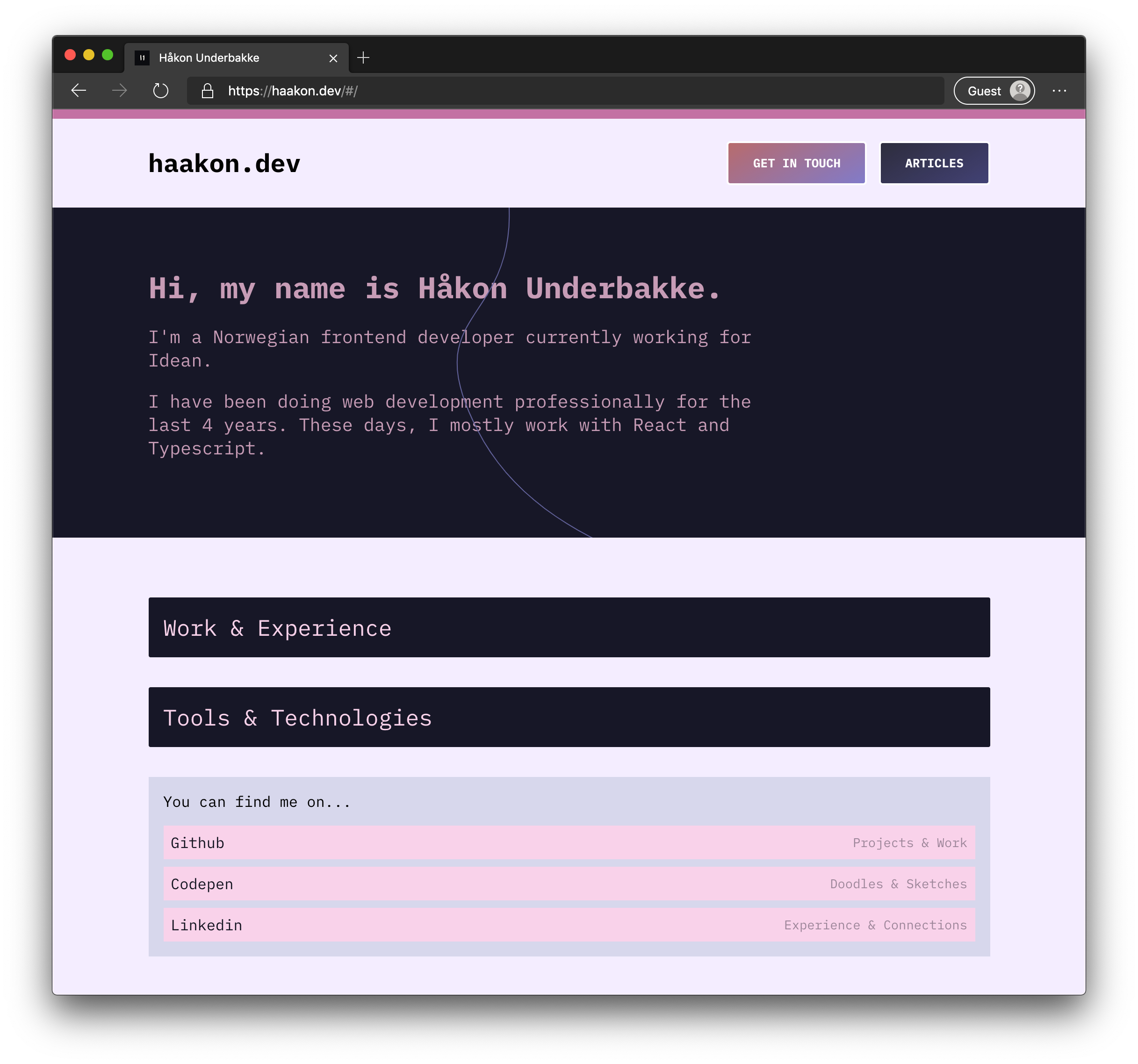
Redesigning my portfolio for the nth-time()

My portfolio is, at heart, just a big hobby project. I love tinkering with the design, and it’s a nice workplace to try out new methods and designs.

This time around, the main reason for redesigning (or rather recreating) my portfolio was the code-base. After working at Idean for several months with other colleagues in the front end industry – I’ve developed more of a preference on how I want my codebase to look.

So, without further ado, my redesign:

The stack

  • React
  • Typescript
  • styled-components

Syntax highlighting

I have previously used Highlight.js, but this time around I decided to go for Prism.js. It catches which language it is by looking at the closest parent .language-xxx class. (.language-js). I’ve set language-js as the standard, and whenever I add code-blocks in different languages I just supply them with the correct class through WordPress.

useEffect(() => {
    if (item) {
      (window as any).Prism.highlightAll();
    }
}, [item]);

Mouse tracking button

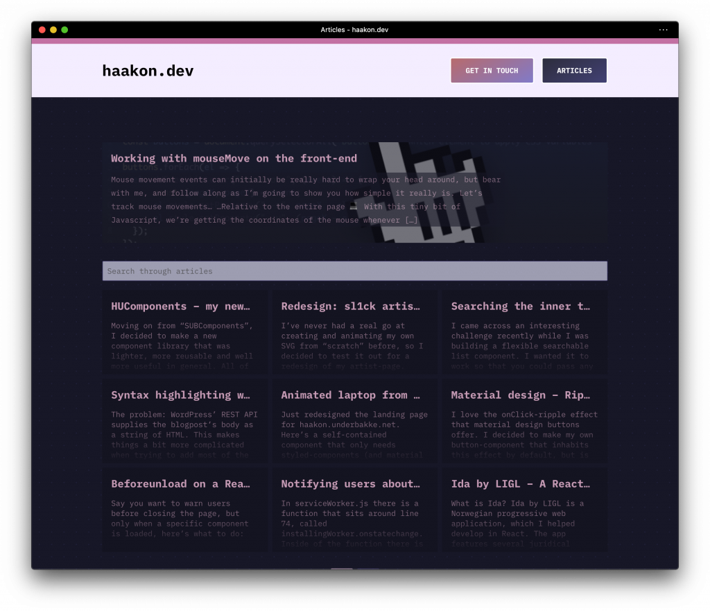
I wrote an article about this over here.

Accessibility

The website is built to work 100% with just a keyboard – and the contrasts are WCAG tested with AAA results. I’m constantly trying to fine tune and fix special case scenarios related to accessibility.

Code

You can find the source for this website publicly at Github.

Working with mouseMove on the front-end

Mouse movement events can initially be really hard to wrap your head around, but bear with me, and follow along as I’m going to show you how simple it really is.

Let’s track mouse movements…

…Relative to the entire page 💻

With this tiny bit of Javascript, we’re getting the coordinates of the mouse whenever it moves and passing them on to CSS-land using CSS variables.

const el = document.querySelector(".circle"); // which element to apply CSS variables

document.addEventListener("mousemove", (event) => {
   const {pageX, pageY} = event;
   el.style.setProperty("--x", pageX);
   el.style.setProperty("--y", pageY);
});

We can now use var(--x) and var(--y) to position something accordingly.

.circle{
  position:fixed;
  left:calc(var(--x) * 1px); /* convert number to pixel */
  top:calc(var(--y) * 1px);
  width:20px;
  height:20px;
  border-radius:50%;
  background:#000;
  transform:translate(-50%, -50%); /* Center on mousepointer: */
}

Result:

This works fine if you just want to track the cursor across the entire page, but let’s say you wanted to only track the movement when the cursor is inside of a specific element…

Let’s track mouse movements…

…Relative to an element 👾

When dealing with stuff inside other stuff, we want to take into consideration that parent element’s offset.

Let me visualise the process.

To achieve this calculation, we’ll use el.offsetLeft & el.offsetTop:

const buttons = document.querySelectorAll("button");

buttons.forEach(el => {
  el.addEventListener("mousemove", (event) => {
      const {pageX, pageY} = event;
      el.style.setProperty("--x", pageX - el.offsetLeft); // taking into consideration element offset
      el.style.setProperty("--y", pageY - el.offsetTop);
  });
});

Now each of those buttons will have var(--x) and var(--y) relative to their own positioning inside their parent. Take a look at this example of a design using this technique:

But wait, this only works sometimes?? 🤯

Yes, this is because we haven’t really properly taken into consideration the offset, just the offset to the element’s direct parent. So if your element is placed directly inside the body-element, like it often is in online playgrounds, it’ll work – but once you place that element into a real design – it stops working.

To calculate the total offset, we’ll create a function.

const getTotalOffset = (el) => {
   let a = el, offsetLeft = 0, offsetTop = 0;
   while (a) { // while "a" (element or parent element) exists
       offsetLeft += a.offsetLeft;
       offsetTop += a.offsetTop;
       a = a.offsetParent; // reassign "a" to parent element
   }
   return {offsetLeft, offsetTop}
}

So to break this code down, we are…

  • Looping through all off the given element’s offsetParents
  • Adding the offsetLeft and offsetTop of each respective parent together.
  • Finally returning those added values when there are no offsetParents left.

Now all that’s left is to implement this function into our code.

const buttons = document.querySelectorAll("button");

const getTotalOffset = (el) => {
   let a = el, offsetLeft = 0, offsetTop = 0;
   while (a) { // while "a" (element or parent element) exists
       offsetLeft += a.offsetLeft;
       offsetTop += a.offsetTop;
       a = a.offsetParent; // reassign "a" to parent element
   }
   return {offsetLeft, offsetTop}
}

const onMouseMove = (event, el) => {
    const {pageX, pageY} = event;
    const {offsetLeft, offsetTop} = getTotalOffset(el);
    el.style.setProperty("--x", pageX - offsetLeft); // taking into consideration element offset
    el.style.setProperty("--y", pageY - offsetTop);
}

buttons.forEach(el => {
    el.addEventListener("mousemove", (event) => onMouseMove(event, el));
});

👏 Now that’s a rock solid mouse-tracker 👏

HUComponents – my new collection of components

Moving on from “SUBComponents”, I decided to make a new component library that was lighter, more reusable and well more useful in general. All of the components are published separately on NPM, so if you find one neat little useful component – you can install just that. The components usually have no dependencies, but a few of them rely on each other.

I will be updating HUComponents with useful components whenever I come up with a good idea – you can look at it as my open marketplace of React components.

Documentation and live demos are located at https://haakon.underbakke.net/components

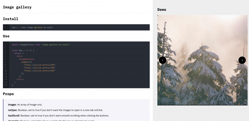
Image Gallery

This one you might recognise from SUBComponents. A simple component for whipping up a quick and rough image gallery.

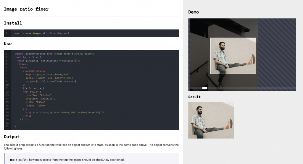
Image Ratio Fixer

This one was quite the project. It allows you to essentially let the user make a custom width/height selection out of a custom image. Allowing you to drag both the image around, the actual selection square as well as scaling the image up and down. It outputs CSS for you to use when displaying the image.

Label Inside Input

A simple component that allows you to make an input-box that has the label inside of it, moving to the top of the input when you are typing.

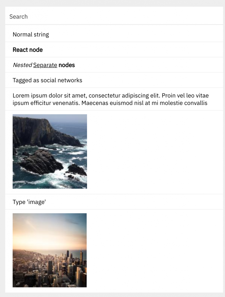
Searchable List

A component that lets you search over an array of objects that can contain react and html nodes, text nodes or just display-items with tags.

The component is made so that it can search through nested nodes as well, scanning each of the nodes and looking for strings – then joining the strings together and searching them.

Besides being able to search strings and nodes, you can also give an array of tags to each of the entries – these can be used to for example search images.

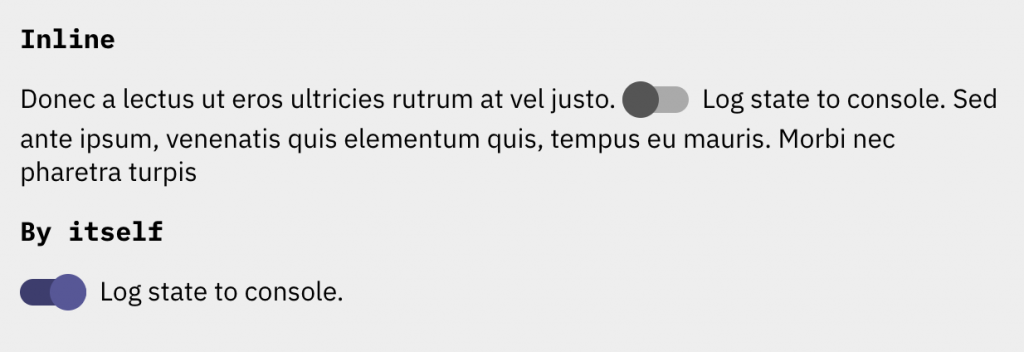
Toggle

A good looking toggle-button as an alternative to a normal checkbox.

Code & Contributing

The code for each component is open sourced at imp-dance/components. I suggest you read through the readme inside of the repository if you are looking to make contributions.

Redesign: sl1ck artist page

I’ve never had a real go at creating and animating my own SVG from “scratch” before, so I decided to test it out for a redesign of my artist-page.

Creating the SVG

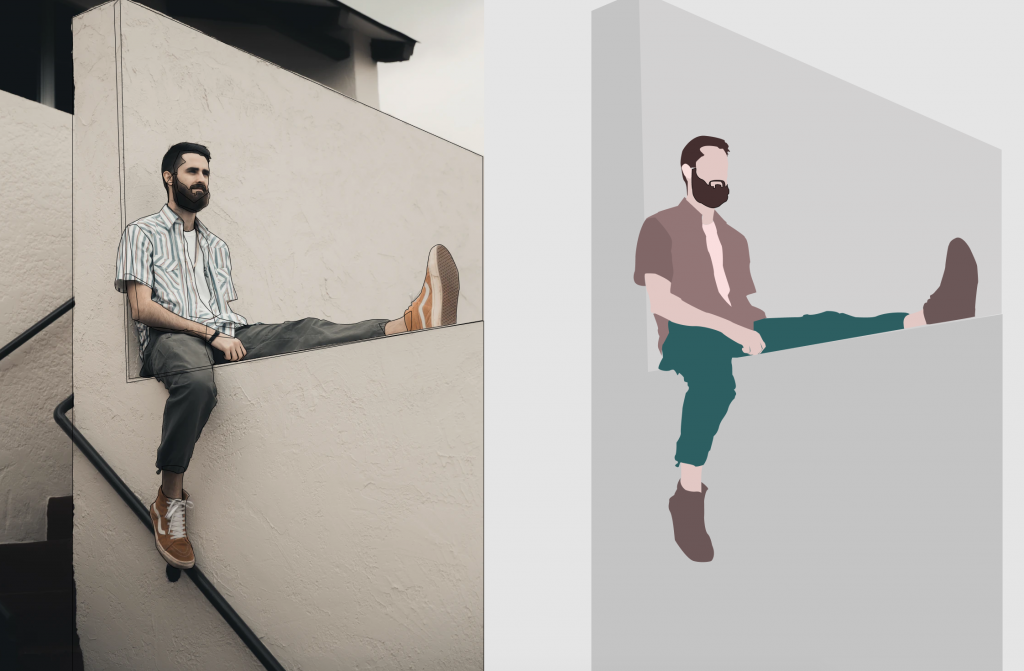
I chose to use Figma to design the vector image, and I found an image from Unsplash to use for tracing.

Using mostly just the pen tool, I traced the different layers of the body. After I was finished, I removed the stroke, and added different fills and gradients to the various shapes. I also grouped the body parts that I wanted to animate together in named groups.

Before exporting the SVG, I made sure to tick Include “id” attribute, so that I could use the IDs of the named group to apply CSS animations.

Animating the body parts

The only real problem I encountered was that the transform-origin was off. To fix this, I had to apply two properties to the element: transform-origin, and also specifically transform-box: fill-box; (which means that the object bounding box is used as the reference box, as opposed to the border-box). After applying the transform-box fix, and setting transform-origin to where I wanted it on the different elements, the limbs would now rotate and move as expected when using transform.

Animating the text

A bit off topic, but in case you were wondering how I did the text effect, this is how – using clip-path:

h1 {
   position:relative;
   color:#fff; /* Make the text initially invisible - alternatively "transparent" or your background-color */
}
h1:before {
   content:attr(data-content); /* IMPORTANT: set data-content="your text" on the h1 */
   position:absolute; /* Defaults right on top */
   animation: h1Animation 2.5s ease-in-out;
   z-index:3; /* just make sure it's on top of everything */
}
@keyframes h1Animation {
  0% {
    clip-path: polygon(20% 0, 50% 0, 0 100%, 50% 100%);
  }
  25% {
    clip-path: polygon(0 0, 50% 0, 0 100%, 50% 100%);
  }
  50% {
    clip-path: polygon(0 0, 20% 0, 0 100%, 70% 100%);
  }
  100% {
    clip-path: polygon(0 0, 100% 0, 100% 100%, 0 100%);
  }
}

Animating elements into view when scrolling

I used the IntersectionObserver API to achieve the “fade in on scroll” effects on the different elements. Here is the code I used:

const observer = new IntersectionObserver(
  (entries, observer) => {
    entries.forEach(change => {
      if (change.intersectionRatio > 0) {
        change.target.classList.add("inView");
      } else {
        change.target.classList.remove("inView");
      }
    });
  },
  {
    root: null,
    rootMargin: "0px",
    threshold: 0.6
  }
); // Creating the observer and setting the callback and options.
const albums = document.querySelectorAll(".albums > a");
const soundcloud = document.querySelector("iframe");
const links = document.querySelectorAll(".blue ul li a");
const items = [...albums, ...links, soundcloud];
// Grouping up all the effected elements
items.forEach(item => {
  observer.observe(item); // Making observer observe them.
});

Final thoughts

It was surprisingly easy and quick to get a decent looking vector graphic done when using the tracing technique, and knowing that I have that potential makes me feel a lot more powerful as in what types of designs and animations I can create from here on out. I highly suggest anyone that hasn’t tried working with animating SVG to try this technique out, it will unlock a lot of opportunities!

If you want to see the animation live, then you can find it at this URL: https://haakon.underbakke.net/sl1ck

Searching the inner text content of nested react nodes

I came across an interesting challenge recently while I was building a flexible searchable list component. I wanted it to work so that you could pass any JSX or react components into the list, and be able to search it just like a normal string. I came up with a neat recursive function to help me out, let’s go through it step by step.

Building the function

The goal of this recursive function is to end up returning a string. Javascript will read the react node as either an array of objects (and possibly strings), a single object, or a string. Let’s first check if the node is an array, and then return each of the plain strings, while running the function again on each of the objects (nodes).

Case: Multiple children

In the case of multiple children, reactNode will be an array.

const getRecursiveChildText = reactNode => {
    if (Array.isArray(reactNode)) {
        // Multiple children
        let joinedNodes = [];
        reactNode.forEach(node => {
            if (typeof node === "object") joinedNodes.push(getRecursiveChildText(node));
            else if (typeof node === "string") joinedNodes.push(node);
        });
        return joinedNodes.join(" ");
    }
};

Now that we’ve dealt with the case of it being an array, let’s deal with the cases of it being a single child.

Case: Single children

In the case of a single child, it will either be an object (new node) or a string.

const getRecursiveChildText = reactNode => {
    const children = reactNode.props.children;
    if (Array.isArray(reactNode)) {
        // Multiple children
        let joinedNodes = [];
        reactNode.forEach(node => {
            if (typeof node === "object") joinedNodes.push(getRecursiveChildText(node));
            else if (typeof node === "string") joinedNodes.push(node);
        });
        return joinedNodes.join(" ");
    }
    if (typeof children === "object") {
        // Found direct child
        return getRecursiveChildText(children);
    }
    if (typeof children === "string") {
        // Found searchable string
        return reactNode.props.children;
    }
};

Finished function

To finish the function off, let’s just add a little failsafe above the single child checks. I have also added a very simple search function, just to demonstrate how getRecursiveChildText might be used.

const getRecursiveChildText = reactNode => {
    const children = reactNode.props.children || undefined;
    if (Array.isArray(reactNode)) {
        // Multiple children
        let joinedNodes = [];
        reactNode.forEach(node => {
            if (typeof node === "object") joinedNodes.push(getRecursiveChildText(node));
            else if (typeof node === "string") joinedNodes.push(node);
        });
        return joinedNodes.join(" ");
    }
    if (children === undefined) {
        if (typeof reactNode === "string") return reactNode;
        else return " ";
    }
    if (typeof children === "object") {
        // Found direct child
        return getRecursiveChildText(reactNode.props.children);
    }
    if (typeof children === "string") {
        // Found searchable string
        return reactNode.props.children;
    }
};

const searchNode = (node, que) => {
    const searchableText = getRecursiveChildText(node);
    if (searchableText.toUpperCase().search(que.toUpperCase()) >= 0){
       /// found match...
       return true;
    }
    return false;
}

Syntax highlighting with React & WordPress

THIS ARTICLE IS OUTDATED. I’m currently using a different, better setup. Please refer to this article instead.

The problem: WordPress’ REST API supplies the blogpost’s body as a string of HTML. This makes things a bit more complicated when trying to add most of the react syntax-highlighting packages, seeing as most of them are wrapper components.

The solution: Highlight.js gives us a function, highlightBlock(), which takes an HTML node, tries its best to automatically detect the language and then applies syntax highlighting.

How to set it up

The first step is to install highlight.js

npm i highlight.js

Then, in a callback after receiving the blogpost and putting it into state, initiate highlight.js using hljs.highlightBlock() on every instance of pre code

import React from "react";
import axios from "axios";
import hljs from "highlight.js";

class App extends React.Component {
  componentDidMount(){
    axios
      .get(
        `${siteURL}/wp-json/wp/v2/posts/?include[]=${this.state.postID}`
      )
      .then(res => res.data)
      .then(blogPost => {
        this.setState({
            blogPost: blogPost,
            loaded: true
        }, this.initiateSyntaxHighlighting);
      });
  }
  initiateSyntaxHighlighting = () => {
    document.querySelectorAll("pre code").forEach(block => {
      hljs.highlightBlock(block);
    }); 
  }
  // ...
}

I use axios in this example to retrieve my post, but the important part is just the initiateSyntaxHighlighting() method.

Choosing a theme

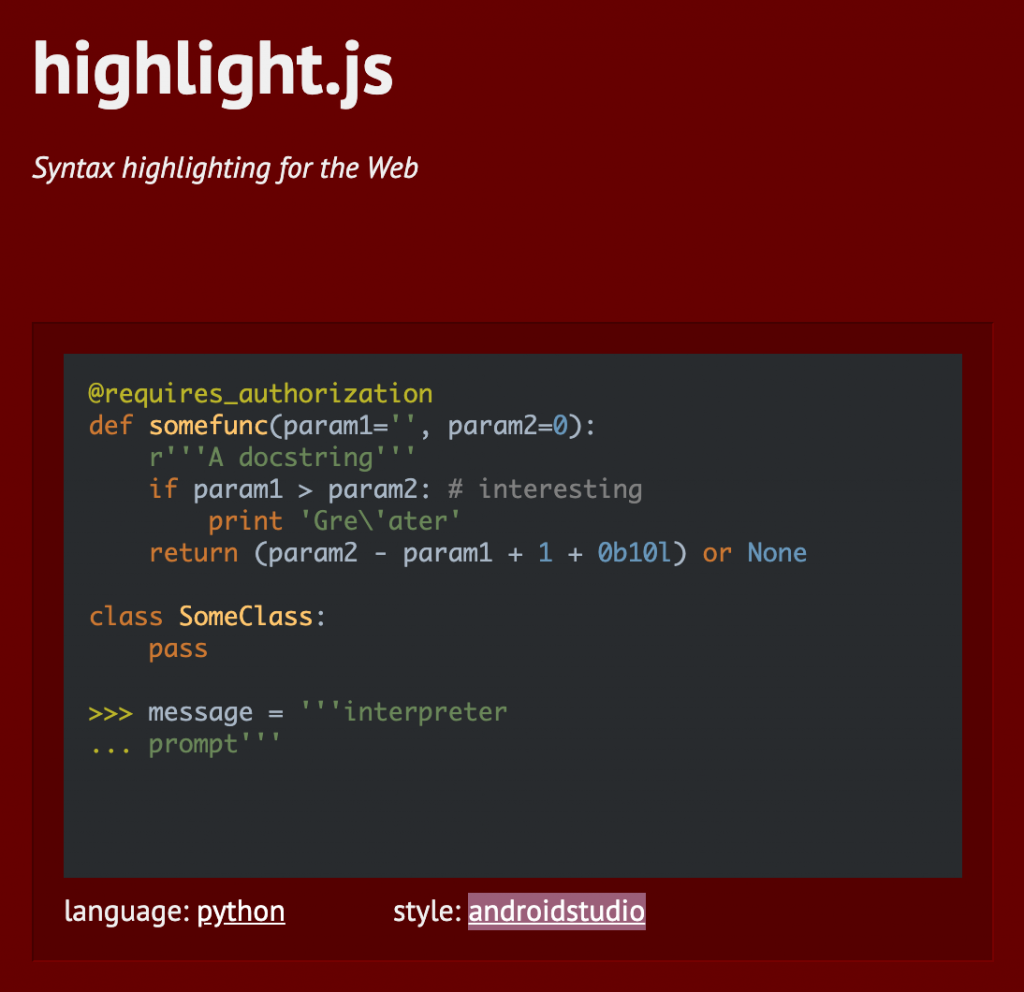
Go to highlightjs.org and pick a theme you like by clicking on the style-name under the demo. Once you find one you like (I use atom-one-dark), go ahead and download the relevant stylesheet from here. Once you’ve downloaded the stylesheet, include it into your project.

If you want to apply some extra styles to the code-box, you can easily do that using the following selector:

.wp-block-code code{
  font-size: 0.7em;
  padding: 13px;
}

Adding line-numbers

To add line-numbers, we are going to use CSS – but first we need to modify our code a bit so that we can target each line individually.

  initiateSyntaxHighlighting = () => {
        const codes = document.querySelectorAll("pre code");
        codes.forEach(block => {
           hljs.highlightBlock(block);
           const lines = block.innerHTML.split("\n");
           const newLines = [];
           lines.forEach(line => {
              newLines.push(`<div class="code-line">${line}</div>`);
           });
           block.innerHTML = newLines.join("\n");
        });
  }

What we do here is first make an array of each line by splitting the innerHTML of each block. Then we loop through this array, and wrap the line with a div called .code-line. Finally, we update the innerHTML of the code-block to newLines.join("\n").

In our CSS, we now need to create a counter.

.wp-block-code code {
  counter-reset: line;
  padding: 17px 40px; 
}
.wp-block-code code .code-line{
  display: inline-block; // important to prevent each line from becoming a paragraph.
  position: relative;
}
.wp-block-code code .code-line:before{
  counter-increment: line;
  content: counter(line);
  display: inline-block;
  position: absolute;
  top: 0;
  left: -30px;
  opacity: 0.5;
}

By resetting the counter on each code, and incrementing on each .code-line, we get an accurate line count positioned to the left of the line.

My thoughts

Highlight.js does a pretty subpar job at detecting the language, as I expected. The upside to this is that it usually does decent syntax-highlighting even though it gets the language wrong. I’m sure there are many better solutions to this problem, but it was a relatively straight forward and easy fix to my problem, and so I’m happy with it. If you want a quick fix for this specific scenario, then I’d definitely suggest this method.