Moving on from “SUBComponents”, I decided to make a new component library that was lighter, more reusable and well more useful in general. All of the components are published separately on NPM, so if you find one neat little useful component – you can install just that. The components usually have no dependencies, but a few of them rely on each other.
I will be updating HUComponents with useful components whenever I come up with a good idea – you can look at it as my open marketplace of React components.
Documentation and live demos are located at https://haakon.underbakke.net/components
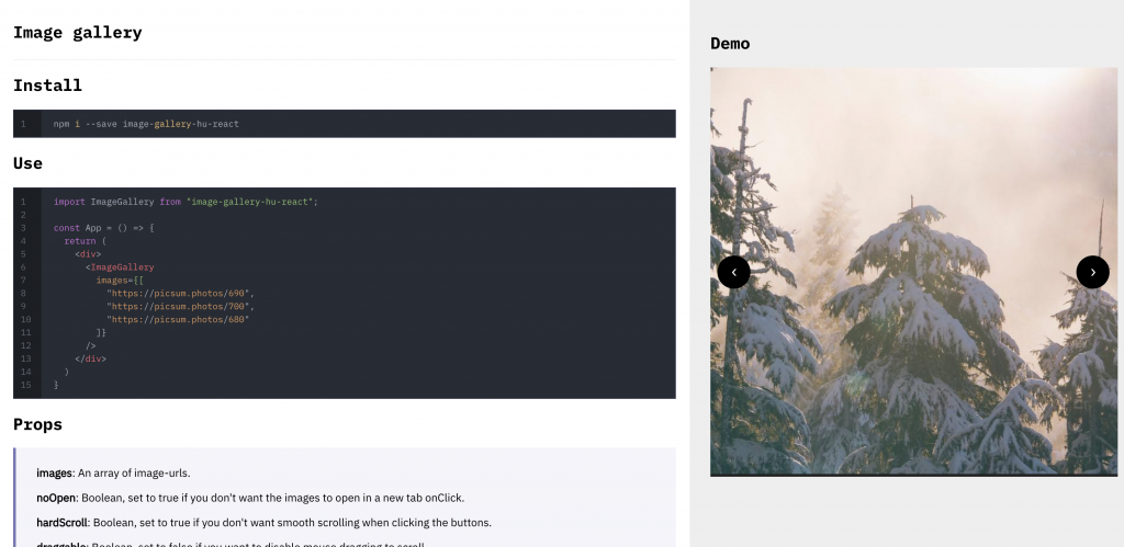
Image Gallery
This one you might recognise from SUBComponents. A simple component for whipping up a quick and rough image gallery.

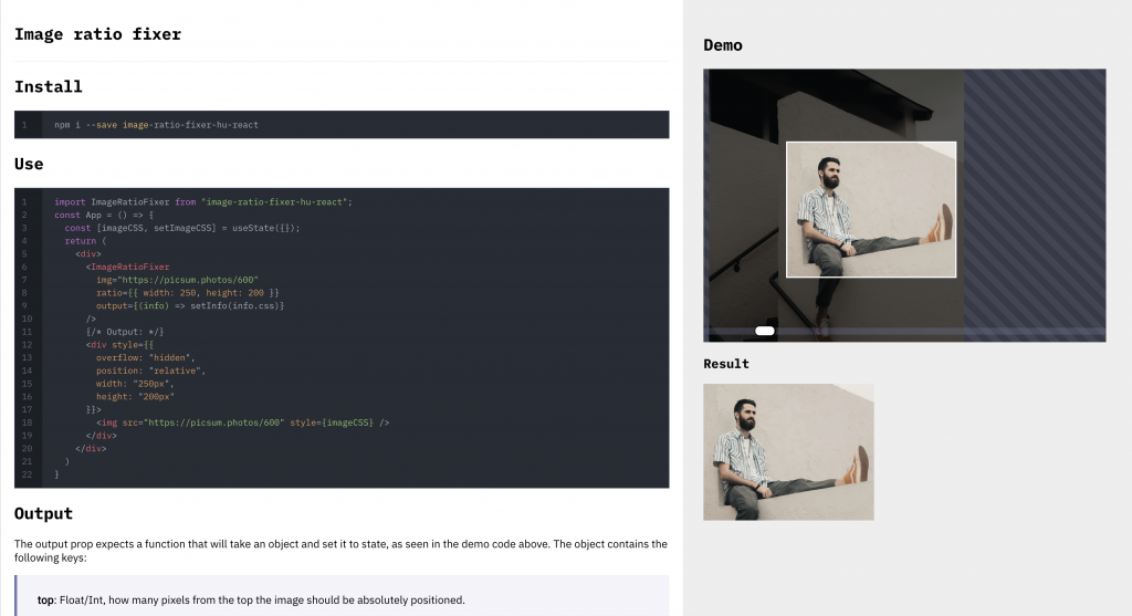
Image Ratio Fixer
This one was quite the project. It allows you to essentially let the user make a custom width/height selection out of a custom image. Allowing you to drag both the image around, the actual selection square as well as scaling the image up and down. It outputs CSS for you to use when displaying the image.

Label Inside Input
A simple component that allows you to make an input-box that has the label inside of it, moving to the top of the input when you are typing.
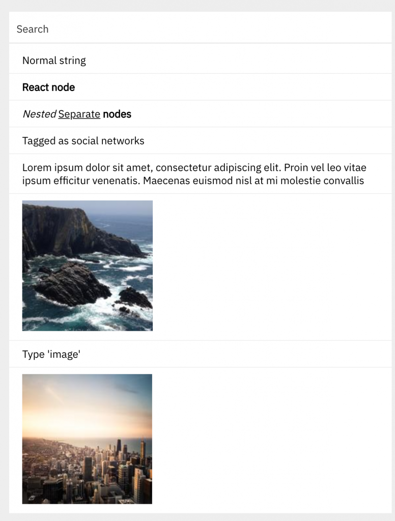
Searchable List
A component that lets you search over an array of objects that can contain react and html nodes, text nodes or just display-items with tags.
The component is made so that it can search through nested nodes as well, scanning each of the nodes and looking for strings – then joining the strings together and searching them.
Besides being able to search strings and nodes, you can also give an array of tags to each of the entries – these can be used to for example search images.

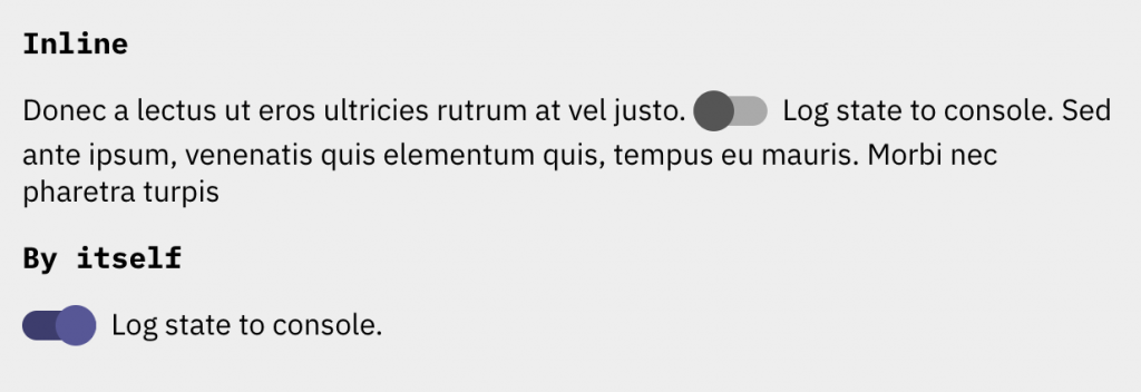
Toggle
A good looking toggle-button as an alternative to a normal checkbox.

Code & Contributing
The code for each component is open sourced at imp-dance/components. I suggest you read through the readme inside of the repository if you are looking to make contributions.